Friday, March 13, 2009

Artist: Anne-Marie Schleiner, Joan Leandre, and Brody Condon


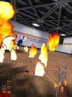
I have decided for this artist exploration I would pick a piece of work I really do not like at all. This is what I came up with and I have to say, even thought I have stared at if for a good amount of time, I am really not liking it anymore then I did when I first saw it. This piece entitled Velvet Strike just seems completely hodgepodge. It looks like the artists just took screen shots from a video game and inserted them into an unexciting environment. The images are unexciting and don't seem to have any real purpose in the piece as a whole. There is nothing visually exciting about this piece and it looks as if I child took a stick book and just covered an advertisement in stickers of fire flames. This is how I feel about this piece but this is what the artists had in mind: basically the artists were inspired by both the computer game Counterstrike and the events of September 11th. Artistically exploring the phenomenon of both of these, they developed an interactive site where their viewer could physically insert "graffiti-like" military images from world events into the virtual space of Counterstrike. 

I understand the artist's intentions and inspirations behind this piece I just don't think that it was nearly as successful as it could have been. Counterstrike is a very interesting game that involves a lot of military issues. September 11th is also, obviously, an extremely issue-filled historical event where tons of artistic inspiration has been derived. I think the artists intentions to converge these two concepts into a piece their audience could interact with was a good idea, just not executed very well. There are not many visually pleasing characteristics involved in this piece of work despite the heavy content issues involved in it's creation. I think the artists could have a found a much better way to integrate these two ideas and create a piece of work that did not look so juvenile.

random thought....

As I scramble to explore six artists by the end of the day, I wonder if our perspective of things are skewed when we have less time to spend on things. For example, I've noticed that as I click on the artists in the Wiki book, I immediately press back if I am not initially drawn to a piece of work. There have been many artists I click on and if I do not like the image on the screen I will not even read about what the piece is about. Is this a natural response or would I spend time reading about this piece of work if I had more time? The sad thing is I realized I probably would do the exact same thing I am doing now, skipping over artists I am not drawn to right away. In concerns to taste, am I hindering by taste by not allowing it to expand? There have been artists in the past I have hated but over time, as I was exposed to more of their work and learned more about them, ended up liking them. I wonder when this point comes though where you let yourself be open to something you may not like at first or when you just let your natural reaction take preference.

just something to think about...

Artist: Paul Kaiser and Shelley Eshkar


This digital image of people moving around in a natural type of environment is stunning considering the realistic qualities of these digitized figures. This piece of work entitled Pedestrian by Paul Kaiser and Shelley Eshkar really captures the real-life movements and situations of the everyday. Using real people to move around and interact with each other, Kaiser and Eshkar recorded these movements and used them in creating their own digital people, adding flesh, hair, and clothing to these bodily movements. At first glance this piece of work just looks like a video recording on a street corner, however, as you look again you notice that this is a made up world created by real live people about real life situations. The complexity of this piece is really intriguing. For instance, the decision these artists made to have this image be from a birds eye view makes the viewer feel like they are peeking in on the people below without them knowing. Also, the reflection of these people in the building adds another interesting quality to this piece and also somewhat mysterious. It's like these people are specimens and both the viewer and building are intently watching their movements while they go on, unaware, with their daily activities. Kaiser and Eshkar have also decided to create these people that clearly have different types of lives. They are not all street cleaners or taxi drivers but instead, seem to come from all different jobs and backgrounds. It's neat to see these different people interact with each other when some of them seem to know each other and others don't know each other at all.
Kaiser and Eshkar do an excellent job at capturing human relationships but presenting them in a very in-human manner. Displaying these very normal human interactions but in such a digitized way sheds a different light on our everyday interactions, it's as if we are seeing ourselves in a knew way. The artists focus our attention on these particular people and what they are doing in this moment in time, in some ways it seems like this is a suggestion on how we are caught in this daily grind of becoming robots. We do the same thing everyday but experience new situations in this constant rubric. 
Both the aesthetics and content of this piece are what make it successful and I would like to see more pieces of work from these artists in the future.

Artist: Natalie Bookchin

I was poking around at a lot of the artists on Wiki site and found that a lot of the artists deal with the issue of video games and literature. This piece entitled The Intruder by Natalie Bookchin is another example of an artist intrigued by this world of video games but also the messages they relay to us. Many of which are filled with violence and sexuality, these games that we are all too familiar with are really filled with very disturbing and graphic images. Taking this into consideration, Natalie Bookchin made a series of ten different "screens" that told a story. She chose a story that involved a young woman, prostitution, violence, and betrayal. Associating this story with the same connotations that many video games have, Bookchin developed a piece of art that told the story of this girl in a video game setting. 

What intrigued me about this particular piece was the mystery this piece of work entails. Some of the other pieces of work I was looking at played with this idea of video games telling a story but the aesthetic result was not very appealing. The images Bookchin creates render a sense of mystery but also a feeling of fear and apprehension. The black and white backdrop she has created looks like she drew it herself and I like this quality of seeing the artists hand. What is even more compelling about this scenery she has created is that the sketchy and faded lines work well against each other pushing out the white whites and black blacks. The girl Bookchin has inserted into these screens is definitely very digitized looking communicating to the viewer that this is a piece dealing with computer or television-like qualities. The orange of the girl and other places where Bookchin inserts color draws a nice contrast against the black and white background popping these images out and leaving the viewer trying to figure out this narration. Each screen progresses well from the previous one insinuating there is a story but not giving too much information that spells out every detail about this story. 

Bookchin's ability to take a subject such as video games and turn it into a piece of artwork that is not only visually pleasing but conceptually exciting, is very impressive. It is obvious that she made some very deliberate decisions concerning each part of this piece and the details she incorporates really makes this piece successful. I hope to integrate her ability to visually display literature in some of my work in this class and am excited about experimenting with different ways of doing so.

Thursday, March 12, 2009

side thought...

As it gets late and my thoughts start turning to mush, I was wondering as I wrote my last artist blog how differently our environments affect our thoughts. I find it fascinating how one object can suggest numerous amounts of interpretations depending on one's past experiences and current knowledge. I can look at something as simple as a piece of paper and to me I immediately start thinking about all the ways I can transform this piece of paper into a palette of colors and shapes that express the thoughts and emotions I hold inside of me. Someone else though might look at that piece of paper and think about the process that went in to making that paper while I was more concerned with the actual paper as a product or means for creating something entirely different. We all see the world so much differently and if I could gather everyone's individual thoughts and ideas and mush them together, I would be so curious to see what would come out of that...

Artist: Torolab


With traveling on the brain (since it is Spring Break tomorrow and all), the fact that my GPS system got lost in a cross-country drive to Colorado over Winter Break, and my fascination with Heath Bunting and Kyle Brandon's piece of work I posted about earlier in the semester, I was immediately drawn to this piece from Torolab. The piece, which is entitled The Region of the Transborder Trousers was an installation piece that incorporated a large animated topographical map that recorded the travels of workers over a five day period along the Tijuana/San Diego border. Existing as one of the busiest borders in the world, the map visually represents the activity of people and cars that pass through these borders daily. 

What I find interesting about this piece is how the artists looked at the information from this map as an aesthetic experience rather than just factual information. I have always been interested in map and as I have travelled to more new places using all different forms of maps, I have recently gotten more interested in maps and their aesthetic value as well as their informational purpose. Just last semester I did a project in my Drawing Studio class about place, involving maps of all the different places that have had an impact on my life. Combining all these different maps and layering them on top of each other created a visual experience I found captivating. 

The way in which Torolab approached this visual experience of a map and how they relayed this experience to their audience I find really exciting. They really took the culture and events involved in the Tijuana/San Diego region and used color, shape, line, and technology to recreate this daily activity into a piece of work that demands the attention of it's viewer. I would love to know more about the decision process behind this piece because I think it would add an even more complex element to this already sensory-loaded image.

Artist: Young-Hae Chang Heavy Industries


Before exploring the actual piece of art created by artist Young-Hae Chang Heavy Industries, it is first interesting to note that this artist's name actually refers to two different artists. Young-Hae Chang is an artist from Korea with a Ph.D. in aesthetics while Marc Voge, an American poet who has been living in Korea, conjoined forces to create Young-Hae Chang Heavy Industries. Their artwork integrates both poetry and digital art to produce an end result of a new way to visually interpret the emotions and stories found in poetry. What these two artists did was take the poetry written by Voge and found a way to visually display his poetry through the use of a web screen where fast paced movies filled the screen following a jazz beat in the background. These movies contained text found in Voge's poetry and, along with the music, provided the viewer with a new way to experience the emotions associated with each poem as well as the underlying message. They chose to display their poems in different languages, to different musical beats, changing the message each poem presented with each artistic decision. 

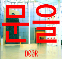
  The piece of art presented above is an example of one of the works of art Young-Hae Chang Heavy Industries produced. The piece is entitled Bust Down the Door Again! Gates of Hell-Victoria Version. The piece was created in 2004 and and takes the original text that was displayed in their text movie and displays it in red over top of a photograph of all the screens that displayed their first version of this project entitled Bust Down the Door! in 2000. 

What drew me to this piece of work and to explore this artist were these large red, blocky shapes that scream in your face. With this A-Z project in the back of my head, I saw these red shapes as letters in another language. As I read about these artists and what their intent was for their work, I realized that they too had an interest in text and used art to visually represent what the text is about. I like how these artists explore text and how to use it effectively as well as what alterations you can do to a text to render different emotions. Using the color red and displaying these letters so largely immediately issued a sense of urgency in me. I felt like the piece was screaming at me to do something but I didn't know what since I couldn't recognize the letters. Those same letters displayed in a different color and much smaller would render a very different message then it does now. I'd like to explore this use of text myself in my A-Z project and maybe by exploring more works by these artists I will learn even more about this type of art.


A-Z Reflection

Since I had to leave early from class I was not able to share my ideas with the class but I did have lots to think about when I got home that night. I realized in my investigations of the letters of my name that I spent a lot of time focusing on where each letter originated from and how they compared to each other as far as purpose and shape were concerned but I did not really explore any ideas of my own on how I would like to use these letters in my project. I thought about this idea of shape and how each letter is just simply a shape but it's society that has given these shapes such extensive meaning. After listening to some members of the class explain their different ideas I realized what I was interested in was this human relationship between humans themselves and a letter. I want to somehow explore this relationship through exploring how humans interact with letters through how they pronounce them, how they use them in communication, and how they physically interact with them through writing. All the different fonts came to mind when I was thinking about using letters and I found that fact one single letter can be written in thousands of different fonts as well as millions different languages. Again going back to human relationship with letters, it's fascinating how different cultures have taken the same letter and has given it a different pronunciation or meaning while still keeping the same shape. 

I am currently helping my boyfriend with a project for one of his classes where he is exploring the world of graffiti art in Berlin. As I was helping him find information and examples of many of the art that decorates the dark walls of Berlin, I started thinking about this letter project and how graffiti artists deal with letters. They use letters as a means of expression whether they are signing their name or writing a phrase they treat those letters as pieces of art. This sort of goes back to my initial interest in the shape of each letter. 

I have a lot of different ideas running through my head about how to investigate this human-letter relationship but I find that my thoughts get rather jumbled when I try to write them down with words (also an interesting aspect about letters) and I think my goal this Spring Break is to turn my thoughts and ideas into sketches. Hopefully this will help organize my thoughts and I can present a more concrete idea for this project later next week. 

Stay tuned...

Blog-less

So I apparently have really missed the boat in this class as far as assignments go. I don't know how I didn't realize I was supposed to be using my blog weekly to reflect on class discussions and write about an artist every week but I did and for that I shake my head at myself. Since when did I become so unaware of assignments? I really need to learn how to look at a syllabus and get my head out of the clouds...

I wanted to write this as sort of an apology for being so undisciplined in this class so far and also because I am about to have an explosion of blog entries appear on this page between tonight and tomorrow in an effort to rebuild my failure at success thus far....Let the blog-writing begin!!

Sunday, March 8, 2009

Alphabet Soup


""I" is from the Greek iota. It first appeared looking more like a Z in the Semitic and Greek alphabets, with the Greek form gradually straightening until the Romans flattened it out. The modern miniscule "i" acquired its dot when blackletter script had to refine the difference between two sequential "I's", which they first did by putting a short line over the two "Is". After awhile th
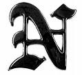
ose started looking too much like "Us" and so the practice became a habit of dotting every "i"". After reading this description I was not very impressed with the letter "I". I found it very interesting that the letter "N" seemed to deem itself more important over the letter "I" since it is much more commonly used. "I", on the other hand, many not be included in as many words as other letters but it is associated with a very important concept, the idea of self. Whenever we want to express our wants, needs, desires, or ideas, we begin our thoughts with "I". "I" may be just a straight shape used to represent a letter, but it is the only letter that can stand alone without any others and represent a human being and what they stand for. If anything, this is the most impressive letter in the alphabet even though it may be the most uninteresting shape.

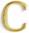
The letter "C" seems to have no real certain origin. It has been decided that it comes from the letter "G" and that the Semites named it gimel but there are no real facts revealing where the shape of the letter "C" stemmed from. Appearing to be an unfinished circle, the uncertainty of this letter's origin also seems to reflects the uncertainty about its creation. It resembles the letter "G", "O", a "D", "Q", and "U" which does not help its cause very much. To me the letter "C" seems like a lost shape with no real origin, not much thought, and lacking a personality. 

Through this project I have really had the time to appreciate letters and what they stand for. They are shapes but at the same time they have a pronunciation, their sound can change when paired with other letters, and they can be combined to make up an entire language filled with different context. There are some letters that seem more important or interesting then others but when it comes down to it, every letter is treated equal when they are combined to create a word because, without the other, words, phrases, and language would not be possible without their cooperation.