Before exploring the actual piece of art created by artist Young-Hae Chang Heavy Industries, it is first interesting to note that this artist's name actually refers to two different artists. Young-Hae Chang is an artist from Korea with a Ph.D. in aesthetics while Marc Voge, an American poet who has been living in Korea, conjoined forces to create Young-Hae Chang Heavy Industries. Their artwork integrates both poetry and digital art to produce an end result of a new way to visually interpret the emotions and stories found in poetry. What these two artists did was take the poetry written by Voge and found a way to visually display his poetry through the use of a web screen where fast paced movies filled the screen following a jazz beat in the background. These movies contained text found in Voge's poetry and, along with the music, provided the viewer with a new way to experience the emotions associated with each poem as well as the underlying message. They chose to display their poems in different languages, to different musical beats, changing the message each poem presented with each artistic decision.
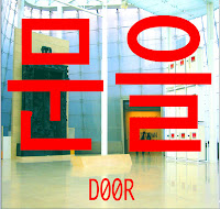
The piece of art presented above is an example of one of the works of art Young-Hae Chang Heavy Industries produced. The piece is entitled Bust Down the Door Again! Gates of Hell-Victoria Version. The piece was created in 2004 and and takes the original text that was displayed in their text movie and displays it in red over top of a photograph of all the screens that displayed their first version of this project entitled Bust Down the Door! in 2000.
What drew me to this piece of work and to explore this artist were these large red, blocky shapes that scream in your face. With this A-Z project in the back of my head, I saw these red shapes as letters in another language. As I read about these artists and what their intent was for their work, I realized that they too had an interest in text and used art to visually represent what the text is about. I like how these artists explore text and how to use it effectively as well as what alterations you can do to a text to render different emotions. Using the color red and displaying these letters so largely immediately issued a sense of urgency in me. I felt like the piece was screaming at me to do something but I didn't know what since I couldn't recognize the letters. Those same letters displayed in a different color and much smaller would render a very different message then it does now. I'd like to explore this use of text myself in my A-Z project and maybe by exploring more works by these artists I will learn even more about this type of art.
No comments:
Post a Comment